Introduction
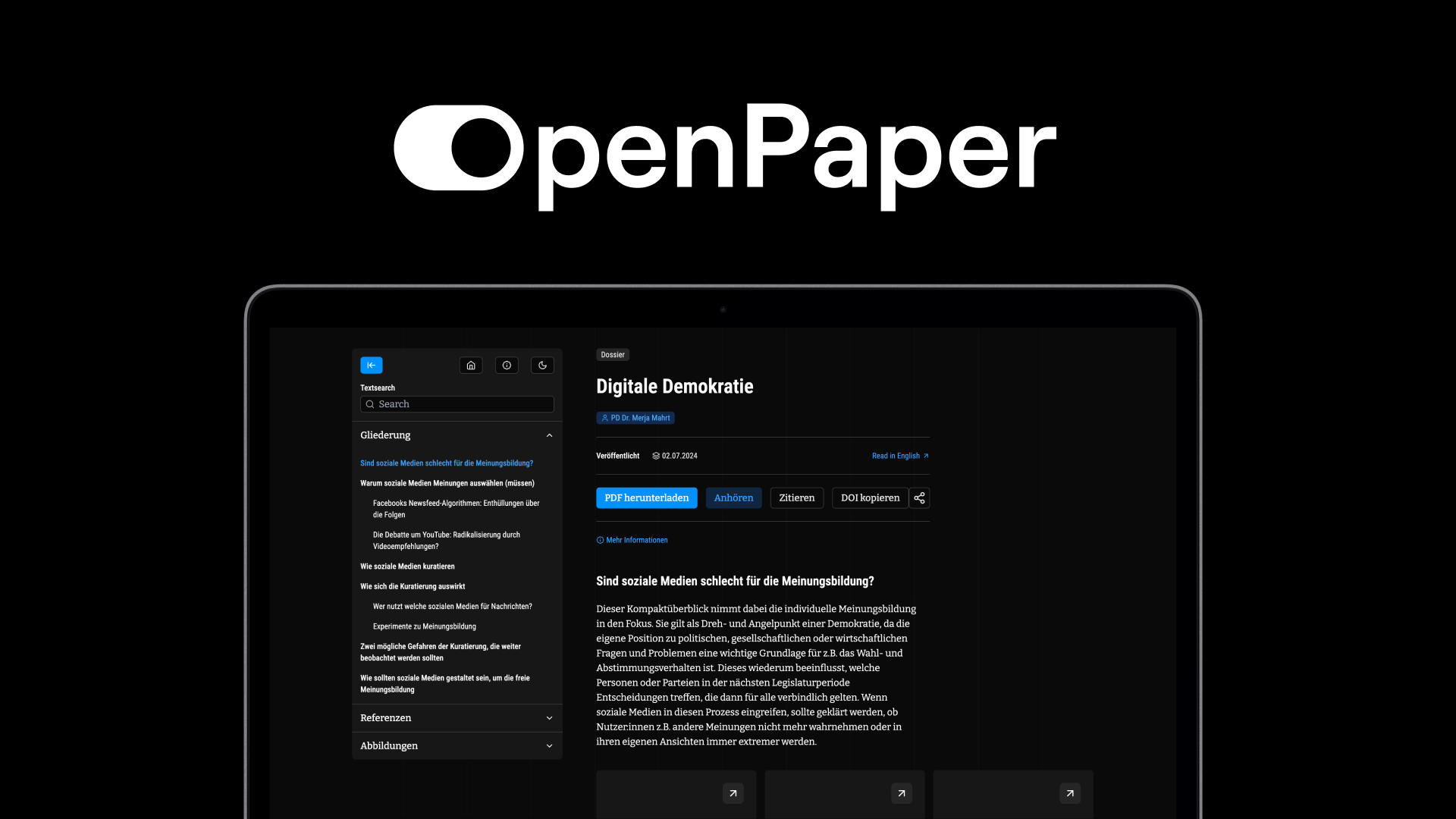
OpenPaper is a platform for transforming static content into reader-friendly, interactive digital publications – without requiring any technical expertise. It bridges the gap between traditional publishing formats and the possibilities of the modern web, making knowledge more accessible, engaging, and understandable for a broad audience.
What sets OpenPaper apart is its focus on interactive reading. Readers can explore content at their own pace through features like excursions for deeper dives into topics, inline glossaries that explain terminology on hover, and a reading companion that supports non-linear navigation. The platform is built on open-source and open-access principles, supports multilingual content and accessibility, and offers custom design and hosting options – including your own domain. Scientific features such as citation management, version history, and automatic PDF generation make it particularly well-suited for research institutions, think tanks, and knowledge-driven organizations.
This user guide covers everything you need to work with the OpenPaper Editor: from logging in and navigating the dashboard, through building pages with the component-based editor, to managing supplementary content like excursions, glossary items, citations, and media. Whether you're setting up your first publication or looking up a specific feature, this guide will walk you through every step.
Video Tutorial
Watch this short walkthrough for a quick overview of the OpenPaper Editor and how the main features fit together. The rest of this manual covers each area in more depth.
Note: Recorded at an on-site training session and presented in German. English speakers can either follow the guide below or enable YouTube's auto-translated subtitles in the player settings.
Login
Open editor.openpaper.de/login in your browser. Enter the email address that was used to register you as a user by your organization.
Instead of a password, OpenPaper uses a one-time login link: you'll receive an email containing a unique link that is valid for a single use only. Click the link in the email and you'll be logged in automatically and redirected to the dashboard.
Dashboard
After logging in, you'll land on the Dashboard. Here you'll see an overview of all organizations you're assigned to. Select an organization to access its content. In the top-right corner you'll find a link to the user guide as well as your user initials – clicking on them opens a menu with the options Settings and Logout.
Navigation & Structure
OpenPaper is organized hierarchically. You navigate through the different levels via tiles – from your organization all the way down to individual pages. The breadcrumb navigation at the top always shows your current position and allows you to quickly jump between levels.
The 5 levels are: Organization → Project → Language → Topic → Page

Organization
The organization level is the highest level in the OpenPaper hierarchy. All projects belong to an organization.
Project
After selecting an organization on the Dashboard, you'll see the Projects overview. All projects within this organization are displayed as tiles. The gear icon on each project tile opens a context menu with the options Edit and Delete. Edit opens the Project Settings.
Project Settings Manage the logo, a brand element, the organization link, and domain settings. Each project automatically receives a default domain. Optionally, a custom domain can be configured.
Language
Within a project, content is organized by language. Existing languages are displayed as tiles. Click Add a new language… to add a new one – select the desired language from the dropdown and confirm with Save.
The gear icon in the breadcrumb bar opens the Language Settings.
Language Settings Configure the overview page texts (Heading and Subheading) as well as legal information (Copyright Text, Imprint Link, and Privacy Policy Link) for the respective language.
Topic
Within a language, you'll find the Topics overview. Topics serve as thematic groupings for your content. Click Add a new topic… to create a new topic. In the dialog, enter a Name and a Slug. The slug is generated automatically from the name and determines the URL path segment for this topic (e.g. /your-topic/). You can adjust it manually if needed.
Topic Settings Accessible via the gear icon in the breadcrumb bar. Here you can configure Heading and Subheading for the topic's overview page.
Page
The lowest level consists of individual pages. Each page is displayed as a tile with a preview image and title. A status badge (e.g. "Staged for Publish") indicates the current publication status. The three-dot menu on each tile provides the options Edit and Delete. Click Add a new page… to create a new page – similar to topics, you'll provide a Name and an auto-generated Slug that forms the final part of the URL (e.g. /your-topic/your-page).
Clicking on a page tile opens the Editor.
Account Settings
Via the user menu in the top-right corner you can access the Account Settings page. Here you can configure the following:
General
Change the language of the user interface.
Profile
Upload an avatar image (recommended: at least 512×512 px) and edit your display name. Confirm changes with the Save button.
Organizations
An overview of all organizations your account belongs to, including the respective join date.
Danger Zone
Permanently delete your account. This action is irreversible.
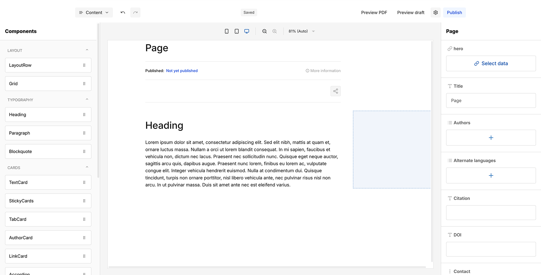
Content Editor
The Editor is where you build and edit your page content. It consists of three main areas: a component panel on the left, the canvas in the center, and a settings panel on the right.
Header Bar
Below the breadcrumb navigation (which still allows you to jump back to any overview level), you'll find a row of editor functions:
Content Dropdown (left): Switch between different content sections: Content, Excursions, Glossary, Citations, and Media. Each section has its own editor view – we'll cover them in detail later.
Undo / Redo: Step back or forward through your editing history, just like in any standard editor.
Save Status (center): Displays the current save state. When all changes are saved, you'll see "Saved". While changes are being written, the status briefly shows "Saving changes" in a yellow badge. The editor autosaves your work automatically, so there's no need to manually trigger a save.
Preview PDF: Opens a generated PDF preview of your page in a new browser tab. The PDF is generated from the current saved state of your content.
Preview Draft: Opens a preview of the current draft in a new browser tab. This preview is not public – it is only accessible to logged-in users and reflects the latest saved state of your page.
Settings: Opens the Page Settings (see below).
Publish: Publishes the current draft to your domain. On success, a green confirmation message "Version published" appears in the bottom-right corner. Once published, all content in the editor becomes read-only. A banner at the top informs you that you're viewing a published page and offers a "Latest draft" link to switch back to the editable draft. Each publish creates a new version in the version history (see Versions in Page Settings below).
Page Settings
Accessible via the gear icon in the header bar, the Page Settings page contains the following sections:
SEO Configuration
Set the SEO Title, Meta Description, and Meta Image for search engine optimization. You can also toggle Analytics (enable tracking for this page) and Indexed (allow search engines to index this page). Confirm changes with Save.
Reading Settings
Configure display options: No Media Container hides the container around media elements, and Show excursions in outline controls whether excursions appear in the page outline.
Versions
A chronological list of all versions of this page. The current draft is highlighted in yellow, published versions in green. Via the three-dot menu on each version, you can View that version, Create draft from version (to restore a previous state as a new draft), or Unpublish version (to take a published version offline).
Components (left)
The left panel lists all available components, organized into four categories:
Layout
LayoutRow, Grid
Typography
Heading, Paragraph, Blockquote
Cards
TextCard, StickyCards, TabCard, AuthorCard, LinkCard, Accordion, Callout, SectionPreview
Media
Medium, VideoEmbed, ExcursionCard
Each component has a drag handle (six dots icon) on the right side. To add a component, hover over it – the cursor changes to a grab hand – then drag it from the panel into the canvas and drop it at the desired position. A blue highlighted drop zone indicates where the component will be placed.
Each category can be collapsed or expanded using the arrow icon next to the category name.
Below the component list you'll find the Outline, which automatically builds a structural overview of your page based on the components you've added to the canvas.
Below is a description of each component, its purpose, and the settings available in the right panel.
Layout
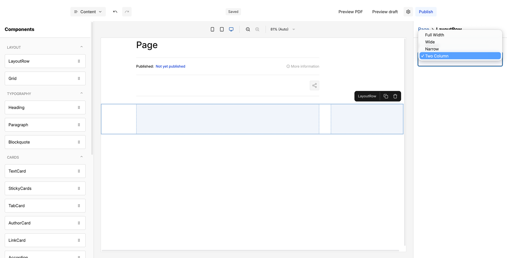
LayoutRow
The primary structural container for content. Every piece of content on the page sits inside a LayoutRow. Use it to define full-width sections of your page.
Settings: Variant (Two Column).
Grid
A flexible column-based layout container for placing content side by side. Place content components into each column cell.
Settings: Variant (One Column, Two Column, Three Column, Four Column).
Typography
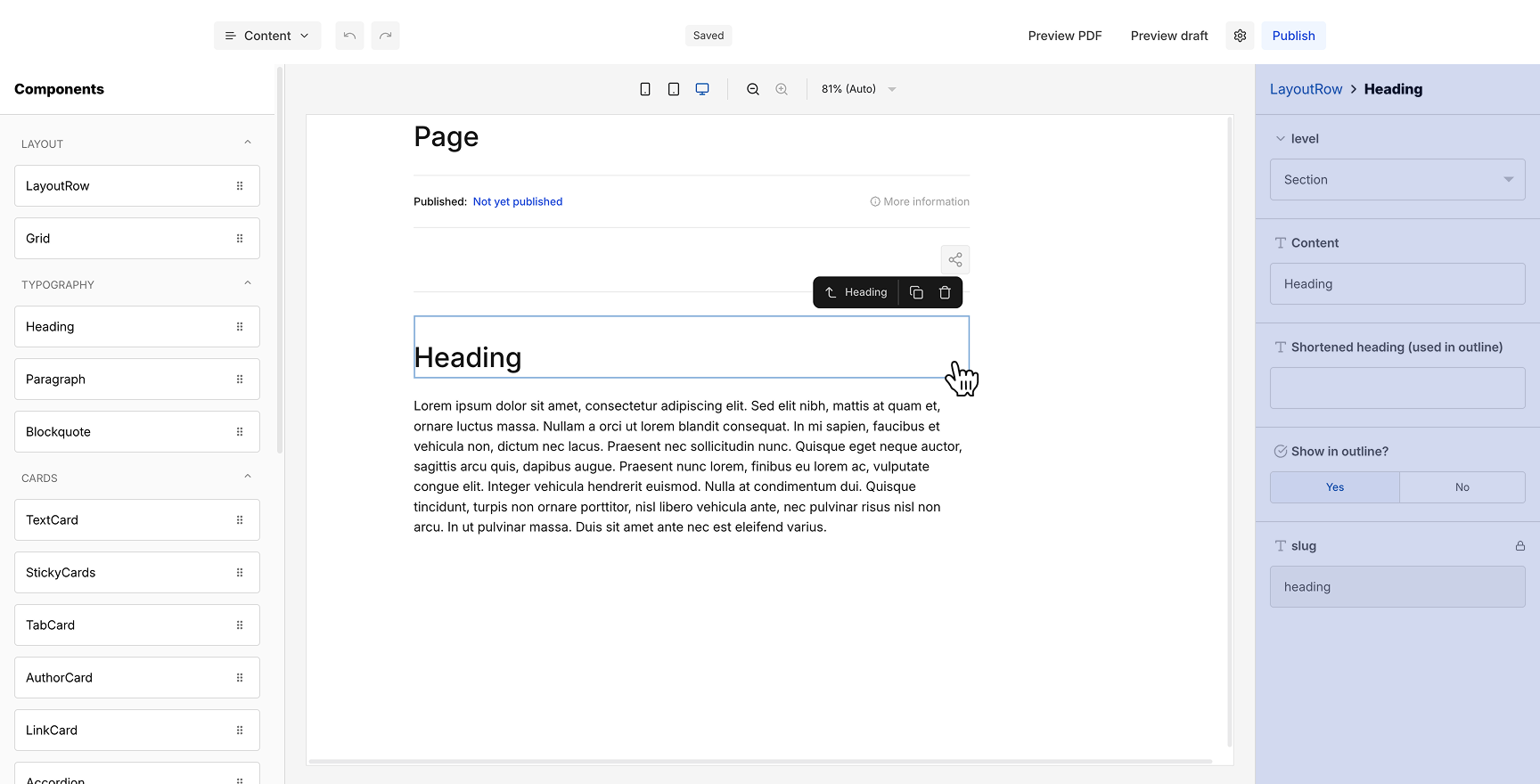
Heading
Adds a section heading to your page. Headings structure the page and can appear in the reader's outline for navigation.
Settings: level, Content, Shortened heading (used in outline), Show in outline?, slug.
Paragraph
The standard text block for body content. Opens a RichText Editor pop-up for formatting text with headings, lists, bold, italic, underline, code, links, glossary terms, excursion links, superscript, subscript, and text alignment.
Settings: Content (Open RichText Editor).
Blockquote
A visually indented text block for quotes or highlighted passages. Also uses the RichText Editor for content.
Settings: Content (Open RichText Editor), Subtitle.
Cards
TextCard
A highlighted content card with an icon, headline, and rich text body. Ideal for key takeaways, definitions, or featured information.
Settings: Icon, Headline, Content (Open RichText Editor).
StickyCards
An item-based component that creates a scrollable stack of content cards. Each item has its own headline and body. Readers scroll through the cards one at a time. Add, reorder, or remove items via the settings panel.
Settings: items (list with + to add), each item has its own content fields.
TabCard
A tabbed interface where each tab holds separate content. Readers click tabs to switch between sections. Each tab has its own icon, title, and rich text body.
Settings: items (list with + to add), per item: Icon, title, Content (Open RichText Editor).
AuthorCard
A profile card for attributing content to a specific person. Displays the author's name, position, photo, and biography.
Settings: medium (Select data), Author name, Position, Content (Open RichText Editor), Used in margin, Profile URL.
LinkCard
An external link card that displays a title, publisher, icon, and optional preview image. Use it to reference external sources or related content.
Settings: Link, Used in margin, Title, Publisher, image (Select data).
Accordion
A collapsible section with a heading that expands on click. Useful for FAQs, additional details, or optional information that doesn't need to be visible at all times.
Settings: Heading, Content (Open RichText Editor).
Callout
A visually distinct block with an icon and rich text content, used to draw attention to important information, warnings, or tips.
Settings: Icon, Content (Open RichText Editor).
SectionPreview
A teaser card with a headline, body text, image, and a call-to-action button linking to another section or page. Ideal for guiding readers to related chapters.
Settings: medium (Select data), Headline, Content (Open RichText Editor), Button (Text, Link).
Media
Medium
Displays an image from your media library. Link it to an uploaded medium via the Select data dialog in the settings panel.
Settings: medium (Select data).
VideoEmbed
Embeds a YouTube video into the page. A privacy notice is shown to readers before playback.
For the Video ID, enter only the ID portion of the YouTube URL. For example, from https://www.youtube.com/watch?v=Ab1Cd2Ef3 you would enter Ab1Cd2Ef3.
Settings: Title (for accessibility), Video ID, Caption (Open RichText Editor).
ExcursionCard
A visual card that links to an excursion. Displays the excursion's overline and title with an arrow icon indicating it opens a pop-up.
Settings: Excursion (Select data), Used in margin, variant (Primary, Secondary, Tertiary), Show in outline.
Canvas (center)
The center area is your working canvas where you assemble the page by adding and arranging components.
Top Bar
At the top of the canvas you'll find device preview toggles for mobile, tablet, and desktop view. The canvas adjusts to show how your content will look on each screen size. Next to the device toggles are zoom in / zoom out buttons, plus a percentage dropdown (25%, 50%, 75%, 80%, Auto) to control how much of the page is visible within the editor window.
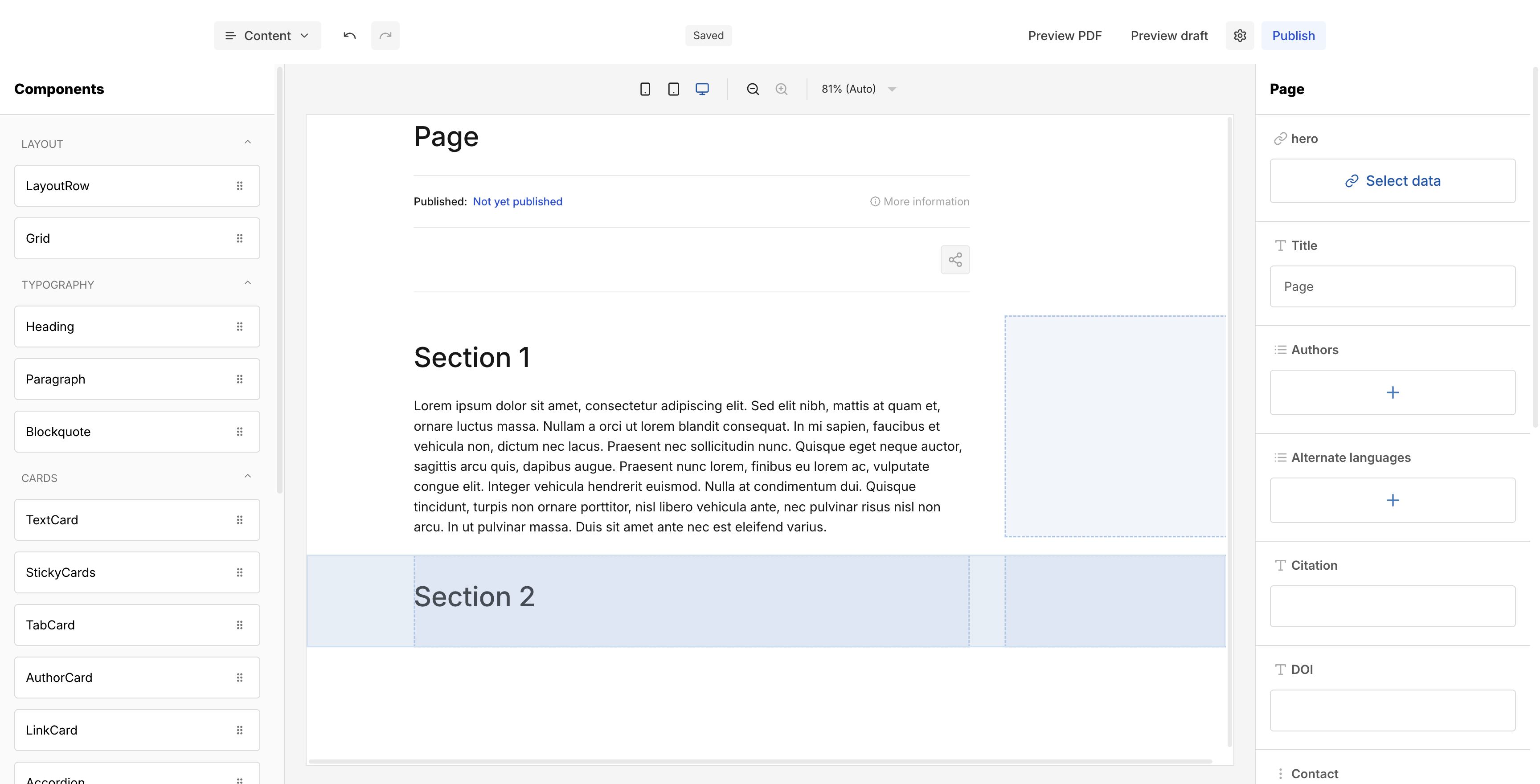
Working Area
The canvas is scrollable and starts empty when you create a new page. The typical workflow is to first drag a layout component (LayoutRow or Grid) into the canvas – this defines the structural frame for your content. You can then place content components (typography, cards, media) inside these layout containers.
When you hover over a component in the canvas, a toolbar appears showing the component name along with icons to duplicate and delete it. Components can also be repositioned within the canvas via drag and drop to adjust their order and placement.
Component Settings (right)
The right panel is context-sensitive and displays different settings depending on what is selected.
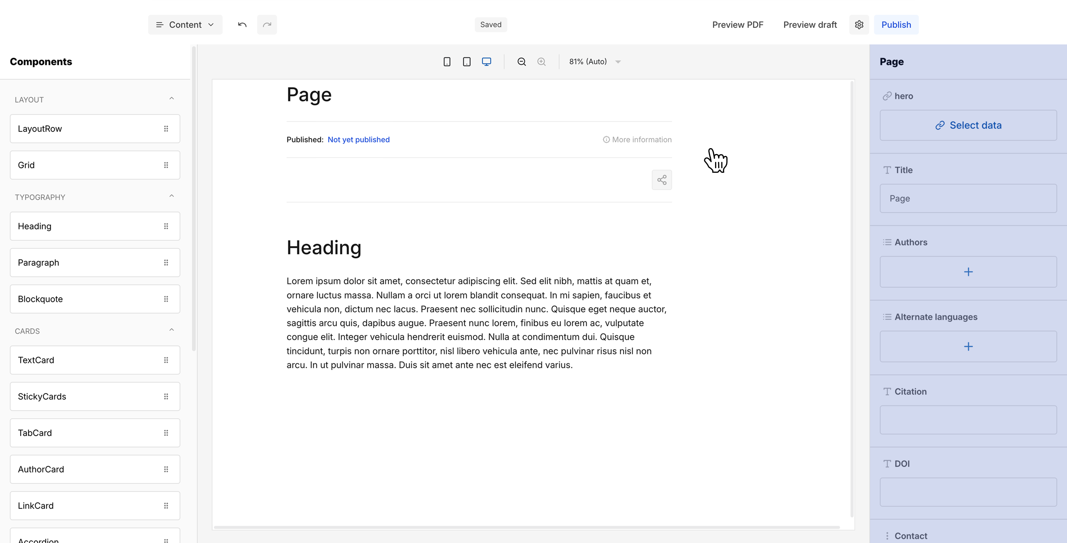
Page Options
Shown by default or when you click the top area of the canvas (above the first component). Here you configure global page metadata: hero image (via "Select data"), Title, Authors (add via +), Alternate languages (add via +), Citation, DOI, Contact (Name and Email), Copyright note (Content, Link Label, and URL), and Image credits.
Component Settings
When you click on a specific component in the canvas, the right panel switches to show that component's individual settings. The breadcrumb at the top of the panel shows the hierarchy (e.g. "Page > LayoutRow" or "Grid > TextCard"). Depending on the component, you'll find dropdowns for variants and options, text input fields for content (which appears directly in the canvas as you type), and style controls for the element's appearance. For example, a LayoutRow offers a Variant dropdown (Two Column), a Grid offers column variants (One Column, Two Column, Three Column, Four Column), and a TextCard provides fields for Icon, Headline, and a button to open the RichText Editor for the content body.
Editing Workflow
Prepare Your Content
Before working in the editor, it is recommended to first set up your supporting content: create your Excursions, Glossary Items, Citations, and upload Media. Having these ready allows you to reference and link them directly while building your page content. It is still possible to add these items later and link them afterwards, but preparing them upfront makes the editing process smoother.
Start with a LayoutRow
When starting in the editor, always begin by dragging a LayoutRow into the canvas. Every piece of content should live inside a LayoutRow – it defines the structural sections of your page. Do not place components directly on the canvas without a LayoutRow, as it provides the necessary structure.
Build Section by Section
The general workflow for each content element is: drag the desired component into a LayoutRow at the position where you want it, click on it to select it, then fill in the content and adjust settings in the right panel. Repeat this process section by section to build up your page.
Use Components by Purpose
Each component has a specific semantic purpose as described in the Component Reference above. It is best to follow these intended use cases – for example, use Headings for section titles, Paragraphs for body text, TextCards for highlighted information, and Accordions for collapsible details. While you are free to use components creatively, keeping similar content types in consistent components improves readability and gives your publication a coherent structure.
Note: The editing workflow for Excursions is identical to the main content editor. You have access to the same components, canvas, and settings panel – so everything described above applies equally when building excursion content.
Excursions
Excursions are deeper content layers that allow readers to dive into a topic without leaving the main page. An excursion opens as a pop-up overlay on top of the main content and can be closed to return to the exact position in the text where the reader left off. They are ideal for in-depth explorations of a subject or optional supplementary content alongside the main narrative.
Creating Excursions
Switch to the Excursions section via the Content dropdown in the header bar. Here you can manage all excursions for this page.
Click Add Excursion (top right) to create a new excursion. In the dialog, enter an Overline, a Title, and a Slug (auto-generated from the title). Confirm with Save.
All created excursions are listed with their overline and title. Via the three-dot menu on each entry, you can View (opens the excursion editor), Duplicate, or Delete the excursion.
Clicking View opens the familiar editor interface where you can build the excursion content using the same components and workflow as for the main page. The header bar shows "Editing Excursion" and the Page Options on the right panel offer Overline and Title fields.
Embedding Excursions in Content
There are two ways to embed an excursion in your page content:
Drag an ExcursionCard from the components panel into the canvas. In the component settings on the right, click the excursion link field (with the lock icon) to open the "Select data" dialog, which lists all available excursions. Select the desired excursion to link it. You can also configure the card's variant (Primary, Secondary, Tertiary), whether it's used in the margin, and whether it appears in the outline.
Glossary
The Glossary section lets you define terms that can be referenced throughout your page content. When a reader encounters a glossary term, they can see its definition without navigating away from the text.
Managing Glossary Items
Switch to Glossary via the Content dropdown. Click Add Glossary Item to create a new entry. In the dialog, enter the Term and its Definition, then confirm with Save. All glossary items are listed with their term and definition text. Via the three-dot menu on each entry, you can edit or delete items.
Embedding Glossary Terms in Content
Inside any text block, open the RichText Editor, select the word or phrase you want to link, and click the glossary icon (book with "A") in the toolbar. Choose the matching term from the list. The linked word will display with a dashed underline. When a reader hovers over it, a tooltip with the term's definition appears.
How Excursions Appear to Readers
Inline excursion links show a small link icon next to the linked text. ExcursionCards display as larger visual cards with overline, title, and an arrow icon. Both options open the excursion as a pop-up overlay on top of the main content, which can be closed via the × button to return to the original reading position.
Citations
The Citations section allows you to manage bibliographic references for your page. Switch to Citations via the Content dropdown.
Managing Citations
Click Add Citation to create a new entry. In the dialog, fill in the Author, Content (the full citation text), and Link or DOI, then confirm with Save. Each citation is automatically numbered and listed with its author, content excerpt, and link/DOI.
Citations can be reordered via drag and drop – changing the order updates the numbering accordingly. The three-dot menu on each entry provides Edit and Delete options.
Importing Citations via CSV
For bulk imports, click Import CSV (next to the Add Citation button). You can download a Reference File to see the required CSV structure, then upload your prepared file via drag and drop or click.
Important: Importing citations will overwrite all existing citations, so make sure to back up any current entries before importing.
Media
The Media section serves as a central library for all images and visual assets used on your page. Switch to Media via the Content dropdown.
Uploading Media
Click Create Medium to upload a new file. In the dialog, drag and drop a file or click to upload, then fill in the metadata: Alt Text, Caption, Source URL, and Source Title. Two additional toggles are available: Show in Reading Companion (useful for figures readers may want to reference while reading) and Expandable (allows readers to enlarge detailed images for a closer look). Confirm with Save.
Uploaded media are displayed as tiles with a preview, filename, caption, and alt text. The three-dot menu on each item provides View (to edit the metadata) and Delete options.
Using Media in Content
To place a medium in the canvas, drag the Medium component from the components panel into the desired position. Click on it and use the Select data button in the right panel to open a searchable dialog listing all uploaded media. Select the desired file to link it to the component.
Media can also be used in other components that support visual content, including StickyCards, AuthorCard, LinkCard, and SectionPreview.
Support
If you have questions, need help, or want to report an issue, feel free to reach out to us. We're happy to assist you with any aspect of working with OpenPaper.
contact@openpaper.de